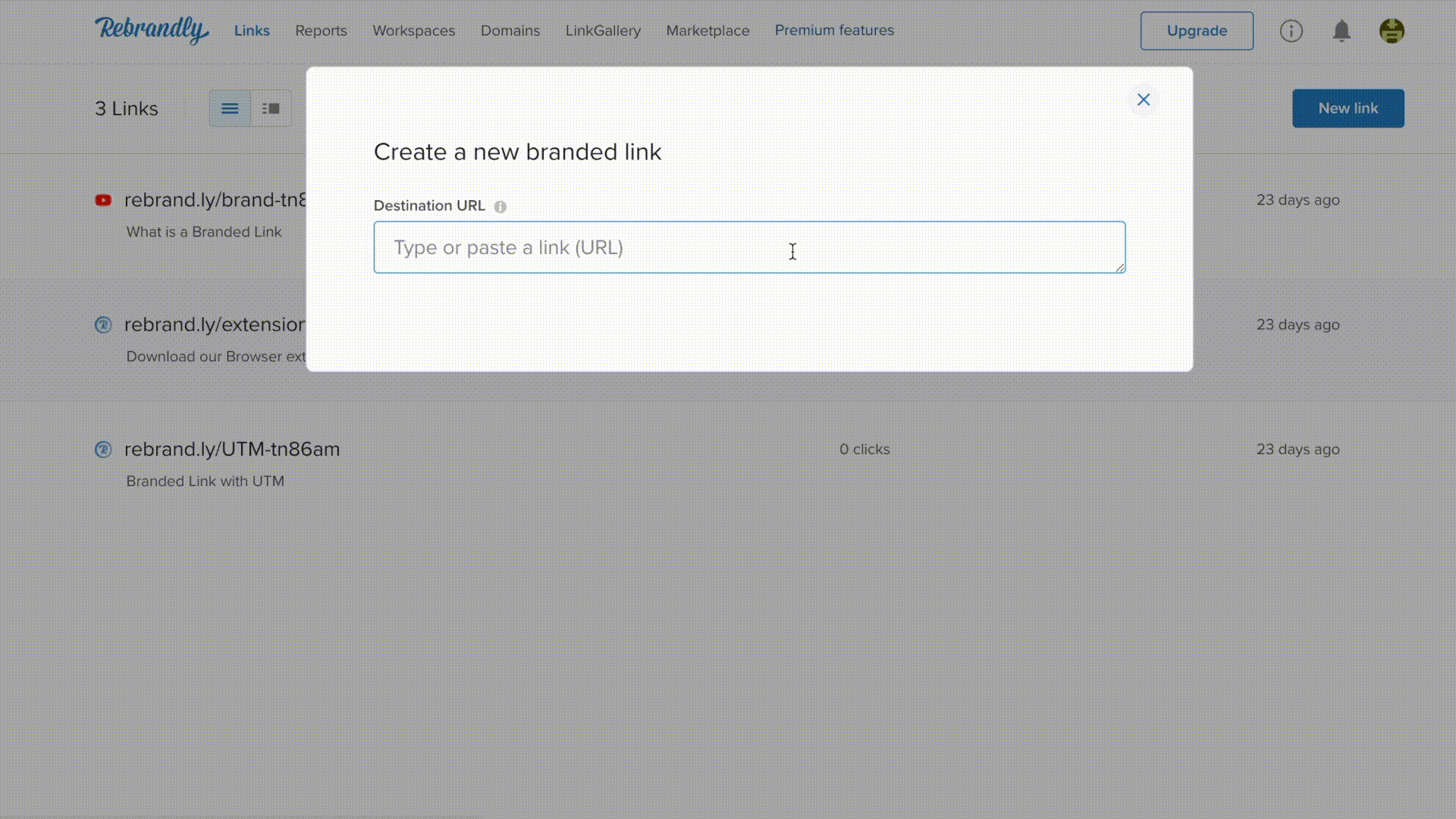
2 Comments

Ten statistics that highlight why a responsive website is essential for your business


In April 2019, there were roughly 4 billion mobile internet users across the globe. The mobile share of digital minutes now far exceeds that of desktop, having reached a staggering 77% in the US as of June of last year — a number that continues to grow in many countries.

Digital minutes graph

Mobile share of total digital minutes in leading online markets as of June 2019—Source: Statista

The growing popularity of mobile usage has brought about the need for a creative website design approach that is mobile-friendly. And so, responsive web design was born.

The term “responsive web design” was coined back in 2010 by a graphic designer named  Ethan Marcotte in a paper he wrote about the need to create “flexible and fluid” websites that adjusted based on a user’s device or screen size.

The key features of a responsive website include:

  • Flexible navigation that adjusts width, layout, and position of elements on the page based on the user’s screen size
  • Simplicity in layout, page elements, and navigation which are easy to read and view on smaller screens
  • Careful use of white space and page composition – nothing should feel crowded or misaligned

At its core, a responsive website highly user-friendly and improves the mobile web browsing experience. 

Now, for the statistics

There are many statistics that support the importance of having a mobile-friendly, responsive website. The following list has been compiled from industry-leading sources and makes a compelling case for creating (or updating) your website so that it’s responsive and mobile-friendly.

1. People tend to access the internet from more than one device. 

A 2018 GlobalWebIndex survey of over 87,000 smartphone, PC and tablet owners revealed that over 95% of respondents used smartphones to access the internet, while 93% used PCs/Desktops and 73% used tablets.

multi-device users

Source: GlobalWebIndex

2. There’s more mobile internet traffic than desktop/PC traffic.

Statista reported that mobile traffic accounted for 52.2% of all internet traffic in 2018. This was up from 50.3% in 2017, and is likely even higher today.

3. If your page doesn’t load (very) quickly, people will bounce.

In 2018, Google reported that as page load time increased from one second to ten seconds, the bounce rate increased by as much as 123%. An increase in load time of just 1-2 seconds can increase bounce rates significantly, as the chart below demonstrates.

page load time

Source: Think with Google

4. Too much clutter will hurt your conversion rate.

Google also found that as the number of page elements such as images, text, and titles increases, the probability of visitors converting drops by 95%. Including more page elements means longer load times, so keep this in mind when evaluating the effectiveness of your website’s design.

5. People will like your website better if it offers a good mobile experience

DesignAdviser reported that over 70% of people are more likely to return to a website if it’s optimized for mobile, but only 55% of companies conduct usability testing to see if their website provides a good mobile experience.

6. People won’t recommend you to their friends if your website’s mobile UX is poor.

Nearly 60% of internet users won’t recommend a business to a friend or colleague if the design renders poorly on mobile. This is particularly true of websites that are not responsive, slow-loading, confusing, or cluttered.

7. Not having a mobile-friendly website helps your competitors.

Google reported that over 60% of mobile users move onto another website if they can’t find what they’re looking for quickly. This is true even if the user likes your business, with 50% of people saying they will use a business less if their mobile website experience is poor.

8. A poor mobile experience can hurt your company’s reputation

Websites that aren’t designed for mobile contribute to an overall poor opinion of your business, with 48% of users in a recent Google study saying they feel frustrated or annoyed with non-mobile friendly websites, and 36% feeling as though they’ve wasted their time. Additionally, over half of the users in question said they’re less likely to engage with a company that has a poor mobile website design, and nearly half said that if a website doesn’t work well on their smartphone, they feel the company doesn’t care about their business.

9. People are increasingly finding your company via their mobile phones.

Mobile queries for terms like “simple + ideas”, “personalized”, and “rewards app” have grown by over 60% in the past two years. As people grow increasingly dependent on their smartphones, we can expect the number and type of mobile queries to keep growing.

10. A mobile-optimized website increases consumer trust and positive feedback

According to TechJury, over 70% of publishers have indicated that a website that is well-organized on a mobile device boosts positive user feedback. And as previously stated, people don’t trust a website that hasn’t been optimized for mobile — which most definitely won’t boost positive user feedback

Takeaways

Responsive website design incorporates many elements—from elegant and simple page layouts to the way a page scales and adjusts to different screen sizes and devices. Other mobile-friendly features such as page load time and ease of navigation serve to sweeten the mobile user experience and ensure that mobile users won’t get frustrated when visiting your website.

Ensuring that your website puts mobile users first can help you meet the increasingly high expectations users have for a good mobile experience while improving performance metrics and customer loyalty. 

Guest Author: Ryan Gould

ryan-gould-bio-image From legacy Fortune 100 institutions to inventive start-ups, Ryan brings extensive experience with a wide range of B2B clients. He skillfully architects and manages the delivery of integrated marketing programs, and believes strongly in strategy, not just tactics, that effectively aligns sales and marketing teams within organizations

Further reading:

This article is about: 

  • Responsive websites
  • Why a responsive website is essential for your business
This post has been written by a guest author who will be the best source for any questions you may have about the content. If you're interested in writing a guest post for Rebrandly please email angelo[@]Rebrandlydotcom with a description of your background and for a copy of our guest-posting guidelines.